A Statistician’s Review of “Republican Primary Election 2012 Results: Amazing Statistical Anomalies” by Francos Choquette, James Johnson published August 13, 2012.
This paper provides evidence to support the rather common hypothesis that voting machines are being rigged. The statistical anomalies they identify in this paper are real and robust; I would call it a solid evidence of a relationship between the number of votes cast in a precinct and % of the vote the favored (republican/Romney) outcome receives.
However, it is important to recognize – and they do – that this is not the same as proof of vote fraud. Statistically, these anomalies qualify as a smoking gun, but a smoking gun is evidence, not proof of malfeasance. I do think these results qualify as sufficient justification to seek verification of the outcome of the actual voting apparatus we are using. Specifically, I would like to see the results of accuracy checks made using the paper ballets and machine printed ballets.
Unfortunately, at this point, I have grown so cynical about our political system that I would not believe anyone’s assessment but my own. So I am planning to do my own audit of my precincts voting apparatus. The only way I’ll have 100% confidence that the results are honest is if I check them for myself. Well, actually, make that 99.99% confidence if I check them for myself. I am a statistician. I know only too well that nothing is 100% certain.
My Background: I’m a professional statistician working in the aerospace industry. I have been certified as a Qualify Engineer for 25 years. I have a Ph.D. in statistics and I make my living analyzing data, including creating new methods of analyzing data. You can check out my credentials at www.bethclarkson.com.
The Data: I have downloaded some of the same datasets they use as examples in their paper. Specifically, I downloaded the 2012 Republican Primary results for Ohio and Iowa from the official state government websites. My results were entirely consistent with theirs, so I can testify to the accuracy of the election data they presented.
The Analysis: They use the cumulative % of the vote as the statistic they are analyzing, which I will explain shortly. I have read a few comments about this choice being a bad one and I must disagree. While it’s not the analysis tool I use in my professional work, I am familiar with it. It is a legitimate choice and they appear to have done the analysis properly.
I have a couple of small technical quibbles about their analysis and the paper itself is somewhat scanty on the details necessary to reproduce their exact results. However, based on the research I have done, I find no reason to reject their conclusions. While this is a weak statement, it is what I feel I can truthfully say. It is possible that some other unknown hidden factor is causing the relationship have exposed. Therefore, I do not find this to be convincing evidence of vote rigging; I do find it suspicious enough that I would like to check voting results for myself.
First, a bit of background on the analysis statistic they chose. Cumulative % is a statistic which converges to the average value in the absence of a relationship with the order of summation. (what does this mean?)
Explanation of Cumulative % and order of summation: Start with the smallest precinct. In Wisconsin, there were eight precincts with only one vote cast. A total of 8 votes with 5 votes cast for Rep (62.5%) and 3 for the Dem (37.5%) Next, there were seven precincts with two votes cast for a total of 22 votes, 12 for the Rep (54.5%) and 10 for the Dem(45.5%). There was one precinct with 3 votes cast, bringing the totals up to 25 votes, with 14 for the Rep (56%) and 11 for the Dem(54%). The next step is to add in the precincts with 4 votes cast, then those with 5 votes cast. This pattern continues up to the very largest precinct with over 5,182 votes cast is the last one added to the cumulative sum.
Basically, under the null hypothesis of no relationship (this also), the nature of this statistic is that it quickly reaches the correct overall percent and sticks to it UNLESS there is an underlying relationship between with the order of summation and the variable being summed.
The null hypothesis is the scientific jargon for the default assumption our test statistic is built on. When we reject the null, it means the data is consistent with our alternative hypothesis – in this case, vote fraud. In order to reject the null, we reject only if the actual result has a very low probability of occurring under the assumption of the null hypothesis – this is referred to as the p-value. It represents the probability of wrongly rejecting the null. The probability of wronging accepting the null is not the same probability at all. This is a crucial distinction often glossed over by non-statisticians. But anyway, that’s my own particular hobby-horse in statistical parlance.
In the case, the null hypothesis is the assumption that there are no underlying factors in the data, it is completely random – i.e. the size of the precinct is unrelated to the % R vote. This isn’t a good assumption, but I have reasonable expectations about how it will differ. The reason I find the documented relationship concerning is that it runs in the opposite direction of reasonable expectations.
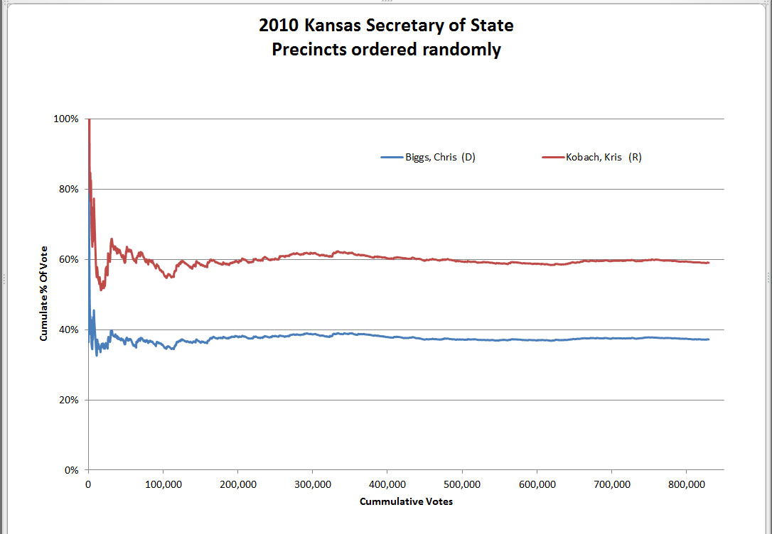
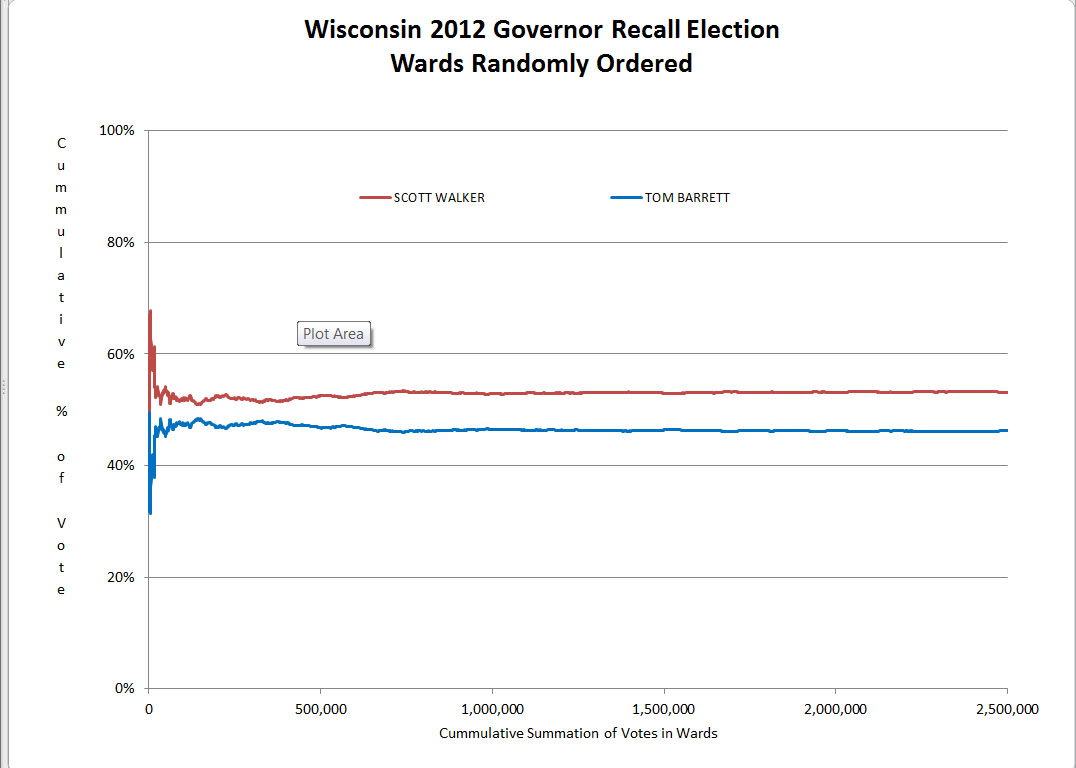
Before you can understand that something is anomalous, you have to have some expectations about normal. Figure 1 and Figure 2 show the type of result expected under the null hypothesis. The lines plotted will show some variability at the far left side, but should become increasingly flat as they run from left to right across the graph. There are some wiggles in the line on the left hand side, but the lines smooth out and become essentially horizontal between 500,000 and one million votes.

Figure 1

Figure 2
The lines converge to their respective centerlines, winding tighter and tighter around the centerline as the number of voters goes up. This is the expected result when the null hypothesis is true.
When there is an underlying relationship between the order of summation and the cumulative percent, this relationship is revealed by the slope or curvature in the lines as they move from left to right. When we order those same precincts from smallest to largest, as in Figure 3, it becomes apparent that the smaller precincts are different from the larger precincts. This is not surprising as it’s well known that rural areas (smaller precincts) lean more republican than the large city precincts.

Figure 3
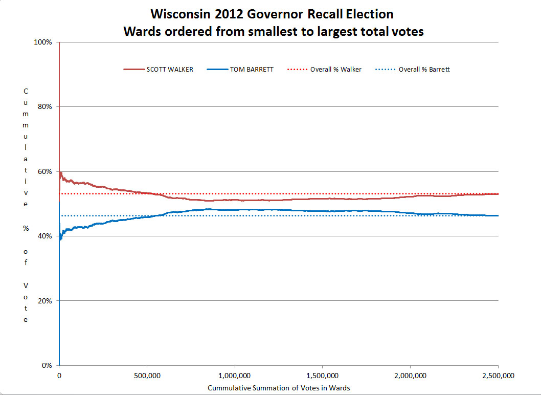
Figure 4
Now consider the graph of the 2010 Wisconsin Governor Recall Election shown in Figure 4. The small/rural and large/urban difference is again clearly seen in the graph. But what is causing the distinct slant in the opposite direction for the largest precincts? This second and unexpected trend is evidence of a previously unknown relationship between the number of votes cast and the percent of vote in favor of the Republican candidate, one that is in the opposite direction of what was expected due to the known relationship between rural and urban precincts.
This relationship is robust and occurs in all of the election results I have downloaded and analyzed so far:
Kansas 2010 Governor (by precinct)
Kansas 2010 Secretary of State (by precinct)
Wisconsin 2010 Governor Recall (by ward)
Florida 2010 Governor (by county)
By the nature of this statistic, with its convergence in the absence of structure, it is easier to see trends in the large precincts by placing them at the front of the summation – i.e. on the left hand side of the graph.
Turning the order of summation around, Figure 5 shows the Wisconsin data summed by starting with the precinct with the most votes cast and summing them in decreasing order. You can see that the trend so prominent on the left side of Figure 4 shows up as a minor blip at the right end. While the initial wiggles can be ignored, there is a definite slope from around 750,000 to 2,000,000 votes. This slope is showing me that a positive relationship exists between the total votes cast in a precinct and the percentage of republican votes for large precincts. This is a separate and different trend from the one tentatively identified as due to the rural/urban characteristic.

Figure 5
So what is causing this? Some unknown demographic correlations with votes cast in the precinct? Or vote fraud? Other explanations, unknown at this point, are also possible. But the structure appearing in the data for larger precincts cannot be dismissed as illusory or mere chance. It’s a robust finding that is appearing in many elections across the USA.
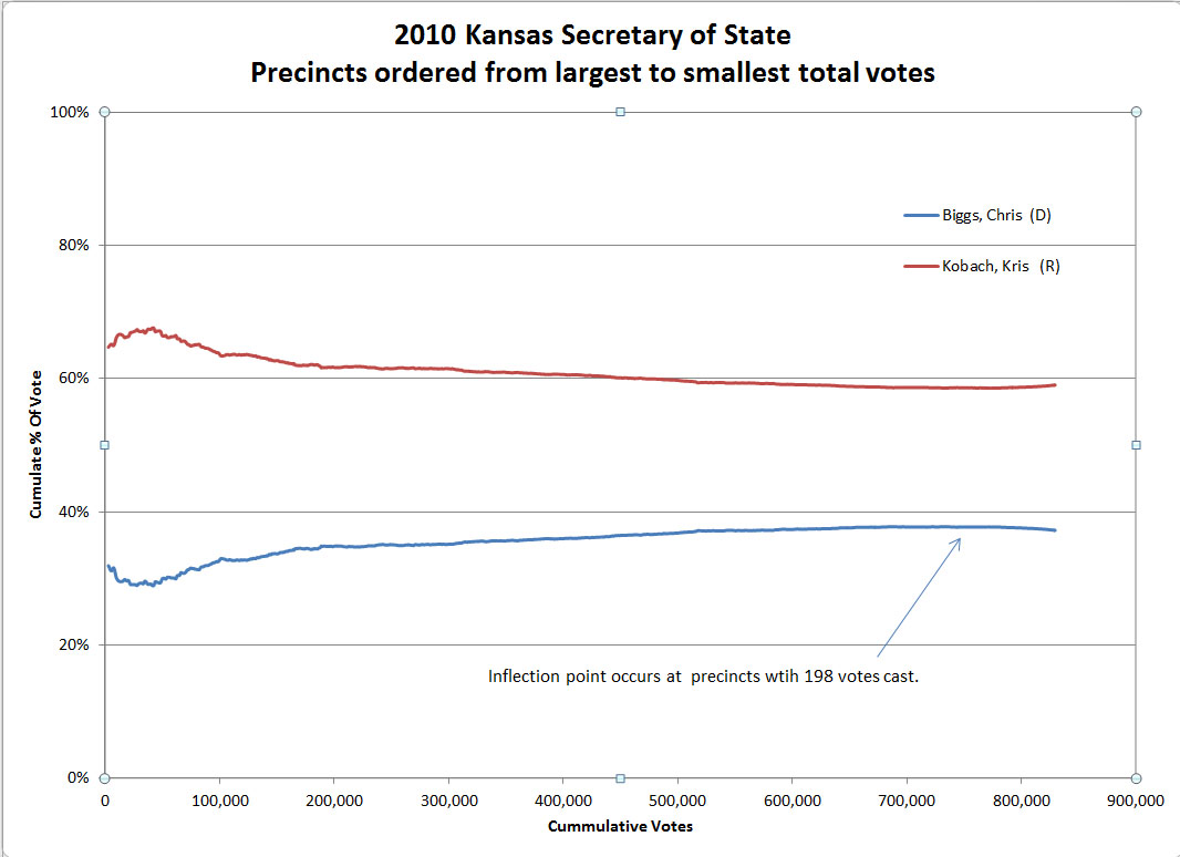
In fact, using the Kansas example from before, running the summation from the largest precincts to the smallest as shown in Figure 6, we see a similar slope in the largest precincts. The structure is similar to what we saw in Figure 5. Now, it’s clear from all of these graphs the Republican candidate won the Kansas election by a substantial margin. If the structure we are seeing in the data from the largest precincts is vote fraud, it was neither necessary nor decisive in the Kansas elections.

Figure 6
Finally, again note that the left hand trend that was so prominent in Figure 2 shows up as a minor blip at the right end.
While a statistical analysis cannot prove fraudulent vote-flipping, this analysis does constitute evidence supporting that hypothesis. The relationship between % of the vote going to the favored republican candidate and the total votes cast is real. I can only speculate about the cause of that relationship. But to assume coincidence for this sort of consistent relationship across many different elections, especially when it is always in the favor of the republican candidate would be on par with ignoring Harry Markopolos warnings about Bernie Madoff’s Ponzi Scheme.
I am extremely unsettled by this evidence. The results shown in the data for the elections I independently looked at are consistent with the expected results of the kind of wide-spread vote-flipping fraud described in the Choquette and Johnson paper.
If it is not fraud, then some other explanation can be found. Some other unknown variable that is correlated with the number of votes cast in a precinct and causes an increasing bias for voting republican. But for now, I find systemic fraud to be the most credible hypothesis. As it makes me slightly ill to think that fraudsters could be so successful for so long, I sincerely hope I can prove this theory wrong with data.
